
Change is the only constant in life according to Greek philosopher Heraclitus. Social and digital trends explode onto our tablets and into our lives then fade away. Remember the furore of Friends Reunited? Brands come and go. Bye bye BHS and Blockbuster. As do celebrities who have their 5 minutes of fame then crash and burn then join Big Brother or rehab. But change is inevitable. That’s why fashion fads come and go (thankfully in the case of the rah rah). Change is also as good as a rest. That’s why we need so many handbags, right ladies? And so many nights out with friends to discuss the merits of each.
Change can be exciting and exhilarating. But it can also be overwhelming and daunting. After almost 15 years on the B2B PR and Marketing scene, it’s time for a change. New brand, new colours, new font, new website.
But same great team. Same great work. Same enthusiasm and passion for all things B2B.
In our game you need to stay ahead of the game. So before we embarked on our own rebrand we treated ourselves as a new client and thoroughly researched the market, competitors and trends first. Then of course we brainstormed, thought-showered, mood boarded and SWOTed, thought outside the proverbial box to come up with concepts, names, straplines, colours, brand values, USPs then wrote a well-thought out creative brief…
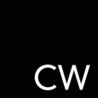
Farewell Cameron Wells.
Hello CW: Creative wordsmiths. Campaign winners. Commercial wizards. Consistently wow.
CW just got brighter.
Our new brand colour is yellow. According to colour psychologists, it means happiness and optimism. It is the colour of creativity, high energy, enthusiasm, hope, fun, and cheerfulness.
Think that sums us up perfectly.
In between our rebrand, we were busy getting nominated for a CIPR award, wining new clients and keeping old ones happy. Doing what Cameron Wells did best and CW will continue to do in our predecessors award-winning footsteps.
Web trends for 2020 and beyond
So what did our web trend research for our own new website reveal as the do’s and don’ts for the next few years?
Here are the top 5 to help keep your website fresh and your clients not complaining about thumb RSI.
1. Mobile first design
Responsive and mobile-friendly web design isn’t optional anymore. In fact, your site should be designed with mobile in mind first. The number of mobile searches overtook desktop searches several years ago and now it’s estimated that over two thirds of people carry out searches using their smartphones.
2. Bold colour and minimalism
Minimalism goes hand-in-hand with one of 2020’s biggest web design trends: colour. Bold, bright, colours will help your brand stand out against the soft neutrals that a lot of companies have chosen over the past few years.
Using colour mindfully to evoke certain moods will be big in 2020. Colour psychology has been used by marketers for years to help create brands and influence consumer perceptions and buying behaviour.
3. Organic shapes
Move over geometric shapes of 2019. In 2020, it’s all about organic shapes. Organic or fluid shapes are anything that doesn’t involve straight lines and are inspired by nature, like undulating hills or the asymmetrical and winding curve of a lake or river.
Fluid shapes are a great way to break up sections of a website without harsh lines or angles or to use as integral to background design.
4. Smart video
Video has long been a must-have for websites. People love to watch people. Video is engaging. Video grabs attention. It’s one of the most effective online marketing tools if it has purpose and meaning. Gone are the days of embedding a YouTube video on your site just for the sake of it. One content rich, high quality video is better than a dozen contrived, untargeted ones.
5. Thumb-friendly mobile navigation
In 2020, web design will be all about thumb-friendly design.
If you’re reading this on your phone, look at the way you’re holding it. Your fingers are probably wrapped around the back of your phone leaving your thumb to do all the work. Putting the navigation bar, menu, and even contact buttons in the space your thumb can easily reach makes your site easier to use and improves the customer experience tenfold. And no threat of thumb RSI. Enjoy our new, smart, bright, minimalist, thumb-friendly website…